It's been a very, very, very long time since I have been blogging, but I thought now was just as good of time as any. Especially since I have some time and a fun project that we recently finished that I wanted to share...
My daughter came to me in the early part of the summer to tell me that she had grown up sooo much that she didn't want her little girl room anymore. She said she COULD NOT STAND THE COLOR PINK!! She didn't want to wear pink or see pink. Mom, "I decided that I am just not a pink girl. I like soft colors and simple patterns and I don't want a theme of any kind." All this coming from an 11 year old! Does this happen to any of you who have girls that decide they are women over night?
So, we sat down and discussed what this very old mature 11 year old would like in her new room. She said she wanted to be able to be in the room in her 20's and still love it. Umm... 20's you say! How long does one plan on living at home with mom and dad? Apparently a while!
After talking everything over, we decided to cut costs where we could by picking up thrift furniture and repainting it, building furniture, and using some things we already had. And by WE in the furniture building part, I mean my dad and husband. I come up with the plan and then become a really good assistant to those that can actually build. You do not want to sit on anything I put together with a hammer and nails!!
I have to say, I LOVED finding out what my daughter really liked for her space! She wanted to be surprised by all of it, but I wanted to make sure I was on the right track. I gave her options of fabrics and got her approval on them. I took her shopping with me to pick out some of the accessories. I put together a design board so she could give her opinion on whether or not she felt like it was what she envisioned. After that we hid her away from the whole project! We kept everything covered and hidden in the garage while we worked on the furniture items. When we finally had everything ready to go, we moved her out of her room and into the spare room for a few days. Her hope was for us to give her a room reveal like we do for clients, so that is what we were able to finally do.
She loved how everything turned out!
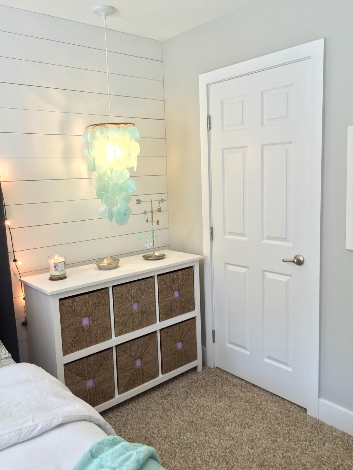
My favorite part of the room, might be the feature wall of ship lap!
The headboard and side units were built by my dad! He's amazing!! Dustin finished the units by painting them in Decorator's White and I covered the headboard in a soft gray linen.
The walls were just the builder beige before. I chose to bring in Sherwin Williams Repose Gray for the other walls. It is my favorite gray by far and we have it in other areas of our house so I wanted to continue the flow into here.
Here is the Befores and Afters of the Room...
BEFORE
Here is the pink bedding that she didn't want anymore. Before she had a scroll detail headboard in black with the pink bedding. A little console table with her fish tank on it and her swing.
AFTER
We picked up the white duvet bedding from Pottery Barn Teen. The purple pillows where from World Market. We got the patterned turquoise material at Joann Fabrics and had my mom make two pillows and a pelmet.
I gave my dad an idea to go off of and he created two of these units, one for each side of the bed. I just used the Ikea baskets as a guide to how big we wanted the openings. Dustin painted them white and I purchased extra baskets to fill it up. A simple little detail was to add lavender card stock inside the squares of these Ikea baskets. It brings a touch of the lavender to this side of the room and it keeps the look clean so you don't see the stuff inside the basket. I used a little hot glue to adhere them in case we don't like lavender in 5 years ;)
We found these framed pieces at Homegoods and TJMaxx and brought them together in a wall collage. She now has tons of Polaroid pics hanging in the frame with the jute and pegs. One of my favorite pieces in the room was the Good Vibes Only artwork. A really nice thought to remind her to stay positive!
We found these turquoise shell hangers on Save on Crafts a couple years back. They sat in a closet until I thought about turning them into lights. We had an electrician put them in and I picked up the light kit and bulb at Lowes to create the light fixture. Dustin framed out the doors and windows with a flat wood trim and did the larger 8 in base trim around the room.
Lacey spotted this cute jewelry storage hanger at Target to hang some of her necklaces.
We put the large pelmet above the window to match the throw pillows. Creating a larger pelmet and taking it to the ceiling helps with making the window look much bigger.
Since we lost our little bulldog around the same time we started working on this space, Lacey wanted to bring a little something in to remind her of him, so we found this bulldog with a little bling collar at TJMaxx.
We reused the metal L in this space. It was a previous find from Homegoods.
The dresser was a find that my sister and mom came across at a yard sale. It was lime green and brown and in need of some care, so we put new legs on it, sanded and painted it lavender and I found new hardware to finish it off.
The lamp was from her room previously, so we brought that back in. We picked up a cute tray and bought a few bath items to fill it. To give it a little extra girly touch, we added some flowers.
The really pretty wood artwork is from Pier 1.
We had the swing originally, but added a new seat cushion from Pier 1 and two throw pillows.
Now she can sleep well way in to her 20's in this space! ;)