Even though the recent project we have been working on for our client Susanna in is not 100% finished yet, I thought I would share the progress we have made so far.
If you remember in the last few posts I had shared the Before Pics of the House and the new Items that were being purchased for the space. If you missed em,' you can see those posts HERE and HERE.
Let's start with the Living Room.
Here is a peak of the after (see the rest below)...
Let's take a look at how we got to this point.
This is the design I put together for the living room.


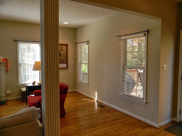
Below are photos of THE LIVING ROOM BEFORE
Over to the left there is where the built-ins are going.
You'll see in the After Picture that we were able to keep the storage behind the new painting by creating a swinging hinge door.

Now on to the AFTER'S of the LIVING ROOM...
A fun red clock behind on the wall pulls the red into the hallway area. A new white slip covered sofa to freshen up the room.
Here is the new sofa table.
Gorgeous rain blue fabric was used to create the custom curtains for the space.
The floor lamp is not actually going in front of the red chair, this was a during photo ;)
The framed door behind the artwork with completed with a trim piece and the client wanted it to blend in with the space, so it was painted the same color as the walls. I think it turned out great!
The door was put together on a piano hinge and door closure attached on the other side so that it stays shut.
Here are some of the accessory pieces we where getting ready to put into the living room, while Dustin worked on installing the drapes.
I chose a faux sheep skin pillow cover and a soft leather chair to add a masculine side to the space.
Also this really fun side table is just waiting for his new blue lamp friend to hang out with him.
An accessory for the side table will finish off this area. The client's family is big into making model airplanes and they love anything related to pulleys and levers, so this floor lamp was a must.
The rug is a gorgeous muted down tone of gray and beige. We chose one for the living room and a smaller version of the same rug for the space in the kitchen.
A punch of red with throw pillows to bring the red from the side chair over to the sofa.
Now for the dining area of the kitchen.
Here is the design board.

Let's take another peak back at the kitchen dining area before...
The wall color was a very unusual green and the location of the dining area light shoved the table location back towards the back door.
Here's the AFTER...
We had the placement for the lighting moved and brought in a gorgeous new light fixture, new table, new rug, new dishware and mats, and new window treatment to match the blues of the living room. We brought the chairs out of the clients dining room to match with the kitchen table, since we are replacing them down the road with new dining chairs and the client currently uses this space for eating.
Here is a shot of the kitchen eating area from a distance.
Today the built-ins are being installed and we have to make one final install of our own to bring in additional accessories for the room including a deep blue throw blanket, tray and accessories for the coffee table and side table and several accessories for the built-ins.
Once that is finished, we will be getting some professional photos taken of the space to show you the final results of the family room and kitchen dining area. :)
Thanks for checking out the update, I hope you enjoyed it so far.


