May 28, 2013

Sand and Sea Beachy Living Room in Navy and Turquoise!

The Design Board Package I wanted to share today is for a family with three little girls.  I was contacted by mom Lisa to help with their living room makeover.  Lisa mentioned she loves the beach and wanted the room to be full of energy.  She described her family as being very active and explained that her girls are sports lovers, but also like to be girly girls so they wanted the space to be vibrant in color while having a laid back vibe.  Lisa also loves the saying "Sandy Toes and Salty Kisses" and was hoping to have that incorporated into the space.  

Here is the Design Board I came up with for Lisa, her hubby, and their little girls...


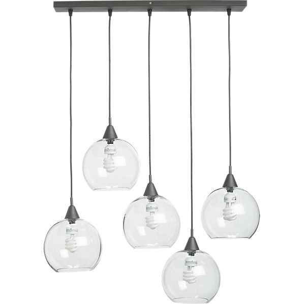
Some of my favorite pieces in the room...

My inspiration for the room began with this Ikat pillow!  


Lisa wanted to relax, so why not kick your feet up on this coffee table while watching television?


This will be a DIY project that Lisa will create to go above the fireplace.


A brand new entertainment center to store all of the girls toys and family game needs.  This is a great storage piece to keep everyone organized.  

As part of the Design Package, I put together the Layout of the future family room, so that Lisa will know where to place things when she puts the room together.

For some reason I can pull up the file to the largest size, but here is the Room Layout that I created for Lisa and her family.  There is really only one wall that the television could have gone on because the wall where the back of the sofa is sits an open pass through. 

Here are a few of the pictures that Lisa sent to help me get a better idea of the room layout...

 This will be the wall where the white entertainment center will go.

A view from the upstairs.


Lisa mentioned that they where going to take the cues from the design board and implement it in their kitchen with new paint and decor.


This wall has a pass through on either side so not really a good place to put the television.  Plus the fireplace is on the other side, so seating would have blocked the fireplace if everyone faced this direction.  

Having lots of pictures always helps me get a sense of the room and allows me to see any potential problem areas in the space.

The Design Board Package like Lisa's, includes a Design Board, A Room Layout for furniture placement, and a complete Source List that has all of the items that you see in the design board in addition to several other items and many hints and tips to complete your room makeover!  


If you would like to reserve your design board please email me at seasideinteriors01@gmail.com.


May 22, 2013

Zen/Spa Retreat Living and Dining Room Mood Board 2 Ways!


Let me start out today by wishing my ridiculously GREAT husband a VERY Happy Birthday!!!  Happy Birthday Dust!  I have to give a big shout out to him for several reasons:
1. Because WELL, he's Awesome!

2. Because he always works hard to help everyone else.  For example, he will be up on a scafolding helping his client and then over to my parents to install a new fan for them.  All while he could have taken the day off. 

We are lucky to have him and just want him to know how much he is loved!  
We have some fun dinner plans so he at least gets the night off ;-)

Now onto worky stuff...

Yesterday I shared the wall color and lighting options for my clients that are hoping to have a Zen or Spa like Retreat.  Click HERE to see those options.  When I met with them for a consultation appointment yesterday, I was also able to share the Design Boards that I created for their Zen/Spa Retreat Living and Dining area.

For the dining room, I chose a softer Spa Like Pallet and for the Living Room I went with more of a Zen like space with some apple green touches.  That way the clients could choose which way they wanted the mood of the room to go and then I could just alter either design board.

The first one is my FAVORITE of the two, but I'll share both.

Here is the  Zen Spa Dining Retreat...
 I was really nervous to share the designs since I knew my clients where so hopeful to have a place not only that they like, but somewhere to escape to after a long day of work, and I wanted to get it right for their tastes.


I really like the freshness that this Design Board brings. The apple green is Yum Yum! With the the fun hanging lanterns in three sizes to the tree branch wall decal, it gives a cooler vibe.

So, which design board did they choose for the color?

DRUMROLL PLEASE........


They chose the muted tones of the Spa like Dining Room.  We may still bring in touches of green, but the overall space will have the feel of the Dining Room Design Board.

I was really hoping to bring in the tree branch decal on the right wall in the dining room and they liked it so much that I got the go ahead.  For the Spa Dining Room Design Board, my client said it was just what she wanted.  She really liked the metal wall structure that holds little tea lights that will go above her buffet and the glass orb pendants where her favorite.  SCORE!!!

Now on to doing a little change around for the living room furniture and then on to ordering some of these cool pieces.

I still have two other areas for their foyer area and sitting room that are in need of new matching light fixtures and a drop down pendant for over the kitchen bistro table.  I will share the final choices in those this next week.

Have a great Wednesday!  


Click HERE

Linking to:


May 21, 2013

Shades of Gray and CB2 lighting!

A couple weeks ago, I had the opportunity to meet with clients in regards to their home that they recently purchased.  They are looking for a completely different design and feel than what they have been used to the past 20 years.  So, now instead of a lodge style home, they are hoping to transition this home into something more Zen.  A place where they can relax and meditate.

So this morning, I sent over some color choices for the Open Concept Living and Dining Room...


I am going to be using Thunder by Benjamin Moore in some areas of our home and it seems to be a shade that I just gravitate too.  So I may be a smidgen biased ;-)

 I recently used Requisite Gray by Sherwin Williams in a client's formal living room and it is a gorgeous shade of gray.  

All of the grays I chose fall under the Griege (Gray Beige) category to bring warmth and peace to the space.

Once the clients decide on what shade of gray they gravitate towards, the living room/dining room area will get a fresh new paint job.

For the Living and Dining space there is a floor to ceiling fireplace in the middle of the room that separates the areas.  One side will be the dining room and the other will be the living/meditation area.  The room has tons of natural light coming in from all of the windows and sliding glass doors along the back wall. 

Here are some of the BEFORE of the Home...


 I am considering bringing in an over sized wall decal of trees in a tone on tone color for this left wall.


 This is the dining room side.

 Another shot of the dining room looking on to a sun room.  All of the furniture including curtains will be replaced with something more clean lines and zen or spa like.

So, this evening I will be meeting with the client and electrician to come up with lighting options since both rooms are completely void of any type of lighting.  To me, lighting is so important in evoking the mood you want in a space. 


A couple lighting options that I am considering are...
FireflyPendantF9

2 of these firefly pendant lighting sets from CB2 to hang down the center of the table.


Or Option #2

NoirPendantS12
Also from CB2 is this Noir Pendant.  If this is the option the clients go with, I am hoping to add two of these over the dining table.


This week, I am working on the Design Board Package for the Living/Dining Room Combo and hope to share that with you soon!


Have a great rest of the day!


Click HERE


May 20, 2013

Spotlight: Lucy and Company

Update:  go here to see about your chance for a free room giveaway!

I came across a designer that really spoke to my sense of style and design when decorating, so I wanted to share her unbelievable design work with you!

Lucy and Company is a design firm ran by owner and operator Beth Keim.  They are located in Charlotte, NC.  They have been in business for several years creating some of what I think are some of the most amazing children's rooms including girl's rooms, boy's rooms, and nurseries.  Not to mention her home makeovers that consist of various adult spaces including master bedrooms, dining rooms, living rooms, and kitchens.  Most of Beth Keim's room designs have some seriously bold color choices and patterns that work so well together.  I spent the better part of the morning browsing her designs for inspiration, and I certainly found it!  You can also check out Lucy and Company blog here.

Here are some of my favorites...


I know right?  I love the combination of wallpaper and fabric that she combines to create her spaces!  The other thing that is great about her design sensibility is that she gets away with infusing tons of color in a space without it being overbearing at all.  I think she accomplishes that by bringing in all of the great furniture pieces that have soft undertones.

Hope you where all as inspired as I was!!

Have a great day!


 Click HERE

May 13, 2013

Orange and Gray Color Combo!

I love seeing color trends that transition so well through different styles.  One color combo that I keep coming across lately, that I really like, is an orange and gray color scheme!  It seems to have a great balance between soothing and exciting.  Since ORANGE is such a bold and powerful color I think it looks best brought in sparingly.  If not, it can really overwhelm a space.

Here are some great spaces using gray and orange that caught my eye...


This is a really soft neutral gray that has just a hint of orange with the drawer and cabinet knobs.  BUT adding the knobs gives it a completely different feel.  It would be such a fun space to do laundry in!


VIA

In this room, the gray comes in with the light gray walls, the lamp, and the gray blue arm chairs.  The orange is equally balanced by bringing it in through the lamps, the frames, pillows, and planter.  Keeping the rest of the room really light, bright, and airy allows for the vibrant colors to not overwhelm the space.  Gorgeous!!


So much about this space makes me happy!!  The balance of the gray walls in the living space and the kitchen and the base cabinet in the kitchen, counteracted by the different shades of orange.  From the burnt orange of the sofa and the kitchen nook, to the soft shades of orange in the rug, and finally to the brighter pop of orange in the dining seating, this space is so well thought out!  I know we are focusing on the gray and orange combo, but the first thing that always catches my eye in a room is great lighting and this space has it!!!  I LOVE the lighting and the placement of the lighting in the living room area and the lighting above the gorgeous dining table is just so cool!

So that no room is left untouched, let's check out a bathroom...


Bathrooms can be both fun and functional and this one seems to do just that.  By painting out the floating shelves in a fun shade of orange, it adds a bit of excitement to the space and takes the afterthought of a nook and turns it into an eye catcher!

Overall, just in these chosen pics, the color combo of gray and orange stayed the same while the design style of the rooms changed from casual, to coastal, to eclectic, to zen!  

Have you decorated any rooms in the gray and orange color combo?  If so, I would love to see some pics!!

If you enjoyed this post and don't want to miss out ;-) click up top there on the right and follow along ;-)


For information on my on-line design services, please click here.


For on-site design services {Greater Hampton Roads and Richmond Virginia}, please email seasideinteriors01@gmail.com for pricing and availability.

May 09, 2013

Guest Blogging at House of Turquoise!!!

Today I am absolutely THRILLED to be guest blogging for Erin at House of Turquoise!!!  Erin's blog is my favorite go to blog for gorgeous rooms in all shades of turquoise.  I'd love for you to come on over, check out the post, and also have a look around at the amazing rooms on House of Turquoise!

I will be sharing a recent makeover of a living room that I created that is accented in touches of turquoise!

Take care and have a great Thursday!


For information on my on-line design services, please click here.


For on-site design services {Greater Hampton Roads and Richmond Virginia}, please email seasideinteriors01@gmail.com for pricing and availability.


Seaside Interiors

May 08, 2013

Beachy Living Room with grays and orange!!!

Are you ready for a little beach vacation?  I know I am.  Although I can't take one right now ;-), I figured I could live vicariously through a Beachy Design Board that I created for two clients who are ready to feel like they are on vacation without having to leave their house.

Gabby and Brandon love the feel of the coastal and beachy style!  So, I created a Design Board that allowed them to have some of the feelings of the beach in the comfort of their own home.


 It is amazing to me what a color can do for a neutral pallet!  It would still be relaxing and soft with the grays and tans, but the orange just brings it to life.

SOURCE LIST
Coffee Table -World Market
Lamp Base  -Target
Lamp Shade -Target
Sofa -Ikea
Bookshelf -Target
Coral -Target
Orange Pillow -Crate and Barrel
Frame -Ikea
Curtains - Ikea
Turquoise Glass Vase -Home Decorators
Nautical Knot Door Stop -Catalog Favorites

Here are a couple pics of the room BEFORE...

I didn't get great shots of the room when I was there, but I got a couple just to share with you the room before they start transitioning it.  Just off to the right is the fireplace and then a shorter blank wall to the right.


On this back wall, since they are young newly weds, I recommended that my clients create a gallery wall of black and white wedding photos.  When I met with them and we looked through some of the items they had collected, I noticed that they had some beautiful photos from their wedding.  I just thought they needed to be displayed instead of kept in an album :)


I left the room with an open flow and brought in an L shaped sofa to give as much seating as possible.  Above the console table is where I suggested they put the picture gallery.  Then they can bring in lamps to flank either end of the console table...

Threshold Wire Cage Lamp with CFL - Clear/Black
I love the mix of metal and glass!  It just looks like bubbles trying to escape to me.


My favorite piece in the room is the coffee table...


I LOVE it!!!  Again, a really cool mix of metal and wood.  I really like the finish on the table too!

I received word back yesterday that they love it and thought it was beautiful.  That means a lot!  Thanks guys :)  

If you or anyone you know would like a Design Board Package created for them, please contact me at seasideinteriors01@gmail.com
  

If you refer someone and they book a Design Board Package with me, then you will receive a $25 VISA gift card!!!

Tomorrow I get the opportunity to guest post at House of Turquoise, so drop back in ;-)

Linking Up To: