
I decided to see what some of the new color choices I picked for painting would look like next to my current paint colors, so I put together a paint palette for my home. I mixed in some different shades of gray or greige to add some depth to different areas in the house.

I am pretty excited about adding the warmer gray tones throughout! After looking at all of the colors together, I think they will be very well matched with my existing shades of turquoise.
First Row (left to rt.): Quietude by Sherwin Williams & Rainwashed by Sherwin Williams
Middle Row (left to rt): Tidewater by Sherwin Williams & Repose Gray by Sherwin Williams
Last Row (left to rt): Thunder by Benjamin Moore & Escarpment by Benjamin Moore
Here is what some of the colors look like in my home...
QUIETUDE BY SHERWIN WILLIAMS

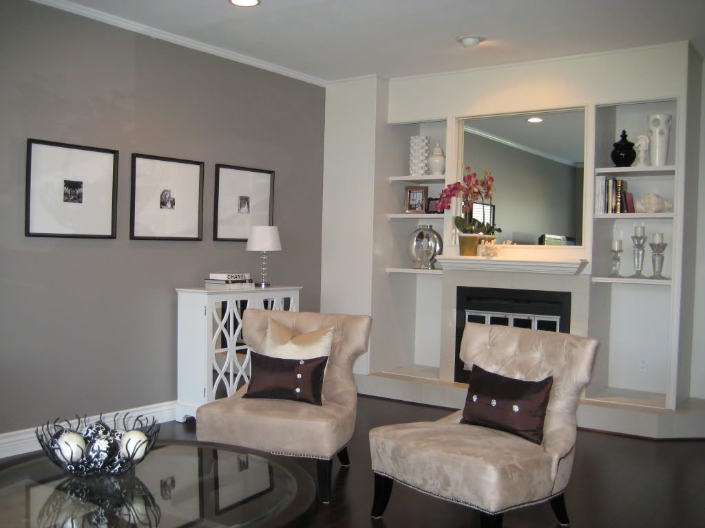
RAINWASHED BY SHERWIN WILLIAMS


TIDEWATER BY SHERWIN WILLIAMS


The colors that are not in the house as of yet, but will be coming in room by room is Repose Gray for the Kids Bathroom and Possibly the basement.
I just finished painting my mum and dad's dining room in Repose Gray and I love the results, so I am definitely adding that to the kids bathroom walls.

My husband painting the trim above the Repose Gray wall in my parent's home.
One of the color choices I just came across that I am STRONGLY considering for the office is...
ENSCARPMENT BY BENJAMIN MOORE

I have been so in to warm grays lately and I really think I could get a lot of work done in an office painted in this color.
Not to mention, as I was just putting this picture on my blog, I noticed that their kitchen banquette table resembles the white desk that I am putting in the office. It's a sign that the office is supposed to be this color ;-)
Here is another beautiful room transformation painted in Escarpment...
I have also narrowed down the color for the hallways and up the staircase and hallway upstairs...
THUNDER BY BENJAMIN MOORE

Here's another photo of Thunder...

I know I am supposed to be focusing on the wall color, but look at the ceiling!!! It would be so neat to look up and see that!
After seeing what some of my choices look like in these Inspirational Photos, I can't wait to get started painting!
If you enjoyed this post and
don't want to miss out ;-) click up top there on the right and follow along
;-)
For information on my
on-line design services which are currently $75 for the month of March, please click
here.
For on-site design services {Greater Hampton Roads and
Richmond Virginia}, please email seasideinteriors01@gmail.com for pricing and
availability.
Seaside
Interiors

yay! love all those beautiful grays - so soothing. and I think repose is one of my very favorites.
ReplyDeleteit was great to see how you have used the colors in each room, helen. thanks so much for the peek. donna
Thanks Donna, Repose is one of my favorite grays too!!!
DeleteThanks for sharing! I am going with gray tones on my main level. I really like using the brilliant metals by Valspar. The finished job makes it look like it's wallpaper and I love it. Happy Painting!!
ReplyDeleteThat's so cool! I will have to check them out! Thanks!
DeleteThis comment has been removed by a blog administrator.
ReplyDeleteCould you tell me what color paint your husband is using in the pic for the trim next to repose gray? :)
ReplyDeleteCn you please recommend 2 reds and 2 blueish grey colors that would go along with thunder an escarpment. Thank you so much for your time. I love your ideas my email address is pamandcurtis@hotmail.com.
ReplyDeletethank you,
Pam Schmuland