April 30, 2013

Pantry Makeover!

I have been completely MIA over the past week or so trying to get some projects done around the house, working on designs for clients, and taking a little me time to go see the performance of Les Miserable with my sister-in-law, niece, and my mother-in-law.  It was such a relaxing evening and a nice little getaway while my hubby looked after the kids!

So today I am back with a design board of one of my truly favorite places to decorate and organize:


THE PANTRY!!!


There is something about making a pantry cute and functional that makes me REALLY REALLY Happy!

The pantry is part of a whole first floor design that I am working on for a client.  Anna is currently transforming the family room as we speak, or as I just ramble to you, which ever one ;-)

So far, I have created her Family Room Design Package and Kitchen Design Package.  I still have her Dining Room and Living Room Design Board Packages to create where we will be bringing in new colors while adding a touch of the Family Room/Kitchen side so that it will feel like a cohesive space.

It may be the smallest space in the mix, but don't cha think it would make your day a little brighter if you opened up the pantry and saw this...


My client asked for something different when it came to the pantry door.  Instead of having to budget in a new door, the best option was PAINT.  I recommended Aqueduct by Sherwin Williams.  


Are any of your interior doors painted a color other than white?  If so, I would love to hear what color you choose to coordinate with your home?


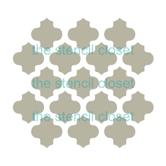
I chose a fun wall stencil to go along the wall behind the shelving, which will cover two of the walls. The shelves will be painted out in white to freshen them up and make them stand out from the wall pattern.  To keep everything organized I found some Farm Style Chicken Wired Baskets and chose glass canisters with the recommendation of putting chalkboard decals on them to finish them off.  

Here are a couple pics of the pantry that my client sent in which I added some details to...


Here is a better picture of the shelving on the right.

An option to give the shelving a thicker look is to add a flat trim piece along the front of each shelf.

And here is the one last look at the Design Board...


Instead of just sharing the Source List for where you can purchase the items, I thought I would share the hints and tips that I send to my clients too, so here is what Anna received for her Pantry Sources...
                                                                                                                                                 

Anna’s Pantry Source List


Labels to Purchase 
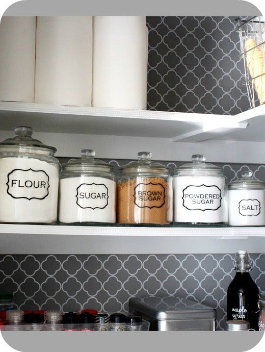
Image of Pantry Jar Labels (set of 5)


For Free Labels


There are a ton of different labels on the link.  They have directions on how to print them up.

Glass Jars
Anchor Hocking Glass Jar Set of 2 - 1/2 Gallon

These glass jars can be found at Target, that’s where I got mine.  Also try Homegoods, TJmaxx, and Walmart.


Soup Can Rack


Dollar Store Tubs for kids snacks


Check at the Dollar store or Target’s dollar section to find some in your color scheme.  These golden yellow would be perfect to bring in a bit of gold or you could do a gray.  If you don’t have a label maker, you can print up some of those tags and glue them to heavy duty card stock and cut out, use a hole puncher to punch a hole in them, and loop a little rope through and tie to the handles.

  Original Door Image is Via Tater Tots and Jello


Crate Storage


You can purchase the ones from places like Joanne Fabrics or Michaels if you have one in your area and weather them up a bit.
Great to keep potatoes or storage bags underneath the bottom shelf.  Or I just thought about it tonight, since you mentioned you like to bake, you could store cookbooks in them. Use a coupon for Joanne Fabrics or Hobby Lobby to get them for cheap.  Depending on what size you get, three in the bottom of your cabinet will work well, turned the opposite way than the picture here.   

  
To decorate the wall behind the shelving, I suggest making it a focal point.

http://www.cuttingedgestencils.com/cascade-allover-stencil-pattern.html

Trellis-stencil-wall-pattern


OR


12 x12 moroccan stencil

You can paint the walls and then put up the stencil and paint over it to give it the effect.  With the stencil, you would paint the walls a light shade and then stencil over in the darker shade to give the two tones.

  
Martha Stewart has a great line of storage solutions from the pantry at Staples.  You can pick and choose which ever works best for your family.  Here is the main link and below that is a few that I think would be helpful.

Pantry Pockets
To keep your coupons, dinner menus, and receipts organized.  Would look nice to the right of the wall calendar.

Wall Manager


 To go above the recycle center on the left wall.

When you are shopping for some of these items, check the dollar store first for storage containers, then hit up Homegoods, TJMaxx, and Target.  For paint color, I suggest going with the same color as the family room and then adding the stencil in white, or painting the whole room a fresh white and adding the stencil in the same color for the family room. 

Please feel free to email me if you have any questions or comments.  Thanks, Helen


I can't wait to see the end result when Anna completes it!   

If you enjoyed this post and don't want to miss out ;-) click up top there on the right and follow along ;-)


For information on my on-line design services, please click here.


Linking To:


April 21, 2013

Industrial Shelving Unit

I had mentioned in my post yesterday, that I was going to share the Pantry Makeover Design for a client, but since we are having a debate in our house today, I thought I would have you join in the discussion.  

To finish up the dining room, I wanted to go with an Industrial Shelving Unit.  I want it to feel completely casual and relaxed where you would just grab a few bowls or a serving dish off the shelf and set the table.  I have quite a few white serving pieces, so my thought is to just have open shelving where I can stack the white serving dishes and dinnerware.  I also thought it would be fun to have a wine holder of some sort to put my wine.  I don't actually own either yet, the wine rack or the collection, lol.  But OH If I had a place to put them, I would.  At least that is what I am telling Dustin in order to purchase this piece.  ;-)

I showed the Industrial shelving unit to him and...

Insert imagine of an extra tight squeezed fart face and that is what he looked like when he saw the shelving I had pulled up online.

Wouldn't that be too much for the dining room?  Why would you want so much shelving to fill?  What would you even put on it? What are you going for a Restaurant?  Blah, Blah, Blah, Blah, Blah.  LOL.

YES, that is exactly what I'm going for.  Hellllooo!  I just bought a sign, which he likes that has our last name on it and the big word RESTAURANT underneath.

So I decided to put together a Design Board so that he could get the full effect of what I am going for.

Here is my DREAM Dining Room...

I went looking for a chalkboard framed in gray reclaimed wood and came across the inspirational pic in the bottom left this morning.  Very similar to the feel I am going with except that my room will have some darker tones and turquoise and navy as additional pops of color to the room.  

The inspiration pic comes from Country Living.  

Although my dining table has feet on the pedestal and is in need of a paint job, I hope to do a gray wash that will make my table look similar to the one in the Design Board when all is said and done.  

Hopefully after seeing this design board, Dustin will be able to get a great sense of what I am going for. 

 Just trust me dude!!! ;-)

For the Industrial Shelving, I saw a lot that I liked, but found only ONE so far in my price range and size.


Industrial Mansard Double Bookshelf

Industrial Mansard Double Bookshelf  VIA 

It may need a bit of a roughing up job, but overall for the price and the reviews, it seems to be a good choice.  What do you think?


If you enjoyed this post and don't want to miss out ;-) click up top there on the right and follow along ;-)


For information on my on-line design services, please click here.


Linking To:


April 19, 2013

Quick and Easy Garden Bed Tutorial

A couple weeks back, we got a jump start on the yard and garden to get ready for the summer.  I knew we wanted to have a larger fruit and vegetable garden so we decided to create some raised garden beds.


They were really simple to put together and took all of about 20 minutes to create each one.  Each box cost approximately $10 for supplies.

To make one of your own, you will need:

Supplies:

6  Pre cut Dog Eared Pressure Treated Fence Picket (Approx. 4 ft tall)
1  2 x 2 piece
Finish Nails for your nail gun

Tools:

Miter Saw
Finish Nail Gun

If you do not have the miter saw, you can always get your Home Improvement store to do the cuts for you.

Directions:

Step 1

Cut dog ears off the top of each picket
* use the cut from the first picket to measure the cut on the rest of the pickets so that measurements will be exact.

Step 2

Cut two of the 6 pickets in half for the shorter ends of the raised bed.
*giving you 4 short pieces

Step 3

Cut your 2 x 2 into 6 pieces.
*We measured ours to be about 10 inches tall so that our pieces would be 1/4 from the top of the box.


Step 4

Using your nail gun, attach two of the cut 2 x 2's to the short boards.

We attached three 2 x 2's when we made the first bed, but decided that you only need 2 pieces, one on either end to complete the shorter end.


When you finish, do it a second time to create the other short end.

Step 5

Attach one short side to the long boards using your nail gun and duplicate it for the other end.


Step 6

Using your nail gun attach the last 2 x 2 in the middle of each long boards and you are done!

Now you can plant all of your veggies :)

I will be finishing them off with a coat of paint and some cute labels.  

Please let me know if you have any questions.

Now I head back to finishing up some really fun design boards!  Tomorrow, I will share the Pantry Design Board for a recent client.

If you enjoyed this post and don't want to miss out ;-) click up top there on the right and follow along ;-)


For information on my on-line design services, please click here.


Linking To:


Home Stories A2Z


My Uncommon Slice of Suburbia

April 18, 2013

The Best Sign Ever! I might be Biased!!

The other day I was heading to my dentist appointment and on my way there I spotted something just off the road at our local antique store.  You know when people say, "It called my name, I just had to have it?"  At least that's what I usually tell my husband. ;-)   Well, this thing really did call my name!!

My last name :-)

See what I am mean about being a little biased, lol.


I did a double take when I drove past and thought how cool it would look in our house.  Our name on a restaurant sign.  I was so excited, but then I thought where the heck would it go?  It is quite a large piece so I wanted to make sure there was a spot for it to fit.

I wasn't able to make it back until the next day to have a look at it.  The lady that works at the shop was so excited to see that I was a Williams.  Apparently she wanted to call all the Williams' in the phone book.  Thankfully I made it there in time before she actually went through with it, lol.

I decided that the sign would go great in our dining room.  My husband met me at the Antique Shop to have a look at it and he thought the piece would be great for our house.

The sign came out of an old restaurant not far from where we live!  It has such character.  If you look behind the Williams' Restaurant sign, you can actually see that it was a grocery store before that.  It was called Williams' Grocery and underneath it, it had the words Drinks-Ice-Meats.  If you look even closer, their was a business there before the Grocery store, but I have yet to make out what that one says.

For our dining room, I want to go with a board and batten treatment like we have been doing in other parts of the house.  Then adding this tin sign just above the board and batten would be perfect!  I want sort of a bistro style in the dining room with a coastal influence.  Ya know, the very popular Bistro Coastal Farmhouse Style!  That's the one ;-)

This is one of those pieces that might go into one of my kiddos homes as they are older and then they can share where it came from, or I might just get buried with it, because what better way to go out other than thinking of Restaurant food, lol.

So, besides the tin sign and board and batten treatment in the dining room, we have a few other things we want to add.

This past weekend, we made another trip to Ikea and came back with this bad boy for the dining room...


STORNÄS Buffet IKEA 2 smooth-running drawers with ball-bearing slides and pull-out stop.  3 drawers with felt strips underneath so they slide smoothly.

Although in this picture, it is quite brown.  In person, it is mostly black with just a hint of brown.  Here it is all  relaxed in its new home in the dining room...

Even in this picture taken with my phone, it looks somewhat brown, but I promise it is really more black, lol.  

 My plans are to get baskets to fill the shelves below.  To go above the buffet, and to keep with the feel of a bistro style restaurant, I want to do a large chalk board trimmed out in reclaimed wood or wood painted to look like reclaimed wood ;-)  Whichever fits my budget.  That way I can put menus up on the chalk board for quiet dinners or maybe a little ladies get together with a specialty drink recipe to try out. 

We also managed to pick up the dining chairs, except for one small hiccup.  One of the chairs had black legs when they should have been white.  We would regularly improvise and just paint them white, but since we are going back in several weeks to get the cupboards for the office, we thought we would see if we had enough patience to wait it out and exchange the chair.  So far, Dustin is doing well with that plan!

Here are three of the four chairs at the soon to be repainted table...

I was thinking of sanding the table and doing a gray wash on it.  So wish me luck on that.  I am really nervous!  At least if I mess it up, I can just paint it a solid gray or black.  I like to have a back up plan knowing things might go wrong on the first try.

In place of the current chandelier, I decided to bite the bullet and get the chandelier I have been wanting.  With a 10% off coupon, I went ahead and purchased the Eclipse Chandelier from West Elm.

Eclipse Chandelier

I really like the bubble effect on the glass and just the curve and style of it overall is so neat!  It should fit nicely in my new Restaurant ;-)

Well, that's as far as we have gotten in the dining room, but here is a little sneak peek on the kiddos bathroom makeover that we are currently working on...


The tile floors are in and hopefully the board and batten trim work and mirror framing will be finished today.

I really love how the floor turned out and can't wait to get the kids back in here using their bathroom.  I thought it would have been crazy having all of us using my bathroom the past few weeks, but it has worked out fine.  SO FAR! 

Pop back in tomorrow for the quick tutorial on putting together garden beds!   Have a great day!!!


If you enjoyed this post and don't want to miss out ;-) click up top there on the right and follow along ;-)


For information on my on-line design services, please click here.


For on-site design services {Greater Hampton Roads and Richmond Virginia}, please email seasideinteriors01@gmail.com for pricing and availability.


April 12, 2013

Kitchen and Pantry Makeover

Hey guys, I had mentioned last week or so that I was creating some design boards for a mom in Oregon.  I finished work on her Family Room Design and after getting great feedback on it, I quickly got started on the adjacent kitchen and pantry.  

Anna has two boys running around the house, so she wanted to keep the fun and lively feel going into the kitchen while still not losing the style and feel she is going for.  

Working in the existing space, I wanted to give the room some character, but not have it feel completely different from the Family room.

To do that, I kept a similar color scheme.

Here is the finished results of Anna's kitchen design board...


Source List


I went with a different shade of gray from the Family Room.  For the kitchen I decided on Knitting Needles by Sherwin Williams.


I also went with the same gray curtains as the ones I chose for her Family Room since the large window in the Family Room and the sliding glass door are both close to each other.  When looking in from the hall, I wanted it to flow well from one area to the next.  

Threshold™ Jacquard Ikat Window Panel


My client has a kitchen table that she would like to repurpose.   I suggested painting it in a white finish and having the golden honey colored rug to go underneath the table and a smaller mat size to go by the sink in the same pattern.

Since she wanted fun, I thought maybe the pantry door would look great in a shade of turquoise like the inspiration photo I found from Tater Tots and Jello.  

To tie in all of the colors from the design board and pull the curtains and even the wall color into the mix, I found this ADORABLE fabric from fabric designer Deborah Edwards.  It is so fun and playful! Anna is going to turn into a window valance to go above the kitchen sink.

Deborah Edwards - Feathered Friends - Vines in Multi


I chose a canister jar set in the same honey color to bring some of the color on to the counter top.  

3-Piece Canister Set (box Set) in the Sorrento-Wheat (gold) pattern by Signature


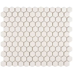
For the back splash tile, I went with a simple white mosaic tile that I think will compliment the cabinetry well. 
Merola Tile Metro Hex Matte White 10-1/4 in. x 11-3/4 in. Porcelain Mosaic Floor and Wall Tile

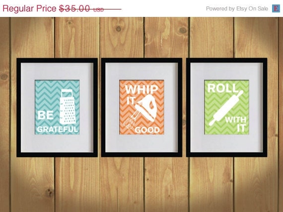
I think one of my favorite finds was the kitchen typography artwork for the walls.  

ON SALE Kitchen Art Print - Chevron, Baking Utensils, Zigzag Stripes - Set of 3 - 8X10 - White, Bondi Blue, Orange, Apple Green - No. KB008

I recommended that my client stick with the turquoise chevron background for both pieces of artwork and then choose which kitchen utensils and phrases she likes best.  The Whip it Good one would either have me singin the "Whip It" song or my version of the Salt and Pepper song "Push Whip it Real Good, bom be dom bom be de de dom.  Either way, I'm sure my kids would be THRILLED with me singing "Whip It" every morning.  I'm gonna go with probably NOT, since my aunt so lovingly told my sister and I we sound like to Bleepin cats getting burned on a stove when we sing.  Aww, I love those truthful family members!

Anyway, I think the artwork is so much fun :-)

These will go on either side of the sliding glass door to give a punch of turquoise color to that area.

One of my favorite spaces to come up with some fun organization and design ideas is the pantry.  Check back for my next post on the cute little Pantry Makover Design I created for Anna.  

Have a great weekend!!!

If you enjoyed this post and don't want to miss out click up top there on the right and follow along ;-)


For information on my on-line design services, please click here.


For on-site design services {Greater Hampton Roads and Richmond Virginia}, please email seasideinteriors01@gmail.com for pricing and availability.


Seaside Interiors


April 10, 2013

A French Inspired Design Board

Today I shall whisk you away to Paris or at least maybe the feel of Paris.  I have been working with Jan for a little while now helping her transform her home in to a relaxing and inviting space.  After we completed the Living Room and Kitchen areas, we moved on to the guest bedrooms and bath.  I created a Nautical Design Board for one of the guest rooms and recently finished the Design Board Package for her second guest room.  She already has an overall feel with reds, and black and white in the room, so my job was just to bring in all the finishing touches and added comfort with additional bedding pieces and new window treatments.

Here is what I came up with for her French Inspired Guest Room...


Source List


Some of my favorite pieces are...

Personalized Pillow Cover
This really sweet pillow from Pottery Barn that you can personalize for whatever date is important.  For my client's, it could be their wedding day or the day they purchased their home.  It is a nice touch to personalize the guest room since it tells a little more about the family that lives there.  In the Nautical Guest Room, I personalized it by bringing in a map of the waterways where the client lives.


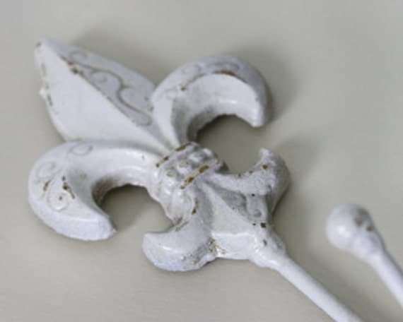
Fleur de lis Wall Hook, Key hanger, Robe hook, shabby Cottage Chic, Romantic Home Decor
Another item I think gives just a little nod to Paris is this Fleur De Lis hanger.  I think two of them sort of off set from each other on the wall will be a great spot for guests to hang jackets and purses.


Smith & Hawken® Glass Dome Cloche - 11.5"

A pretty Cloche with a some greenery underneath would add a little color to the side table underneath the coat hooks.


Lilian Bedside Table
To store my client's printer and laptop, I needed to find something that was pretty yet functional, so when I came across the Lilian Bedside Table on Pottery Barn, I thought it was the perfect fit!

Yesterday and the day before Dustin painted my client's guest rooms and guest bath and the colors are gorgeous!!!

These are the two colors I chose for the guest rooms and bath...

I have used Repose Gray several times now and I honestly love it as a go-to gray.  Mindful Gray was a first for me, but I will definitely recommend it for future clients and I'm saying, it MAY find it's way into my home at some point ;-)

It will take a little bit to bring it all together, but once the rooms are completed, I will share the Before and Afters!!

If you would like a Design Board Package of your own, please feel free to contact me at seasideinteriors01@gmail.com.  There are different package options that you can look through on my side bar in order to decide which one is best for you!

If you enjoyed this post and don't want to miss out click up top there on the right and follow along ;-)


For information on my on-line design services, please click here.


For on-site design services {Greater Hampton Roads and Richmond Virginia}, please email seasideinteriors01@gmail.com for pricing and availability.


Seaside Interiors

Linking To: