May 28, 2012

Pop of Red

I hope everyone had a wonderful Memorial Day Weekend!  We actually did some painting, but found enough time to enjoy ourselves.

While I have painting on the brain,  I thought I would come up with some ideas for painting our spare room.  So far, I know I want a British vibe, but I have to do it without it screaming red, white, and blue union jack,if you know what I mean ;-) 

Here is where my inspiration came from:

A huge piece of Ikea wall art
IKEA London Double-Decker Bus Photo (Facebook) $40
I found it on Craigslist and purchased it for $25 smackers!

What I love so much about it is that it is very understated with a pop or red!  With that idea in mind, I would like to bring in a gray, black, silver, and white color scheme with a few punches of red here and there.  This room will have a completely different feel than my main living space, but I'm just fine with that.  I Don't think every room has to have the exact same feel.

I have a few pieces of furniture that need some updating, so I was going to probably paint the furniture white except for one dresser that I am contemplating turning the front of it into the union jack.  I would like to get two mirrored side tables that look like these:


To make the room very personal, I would like to take a pic. of my Bulldog, add the clipart crown to him, print it on transfer paper, and make a pillow for the bed!  I think that would be a lot of fun :)


This picture below caught my eye.
This would be so much fun to do on the closet door.  I know it gives a younger vibe to the room, but I love it.  It would be a great laugh for my family when they stay!


And maybe a picture or two of these guys...

Pinned Image

I would like to go with gray for the wall color.

Maybe Antique Tin by Behr like this gorgeous room below for the main wall!

Pinned Image

If I don't go with the mirrored side tables, I would go with white ones like the ones above from Ikea.  I like the oval silver mirrors above the units.  Maybe red lamps on either side of the bed. 

After thinking about how I wanted to incorporate the red, I decided to go snooping around to get a little inspiration.

AND THIS IS THE INSPIRATION I FOUND...


To me, when you keep the paint neutral on the walls and cabinets, it gives you wiggle room to paint something that is usually a neutral color, a more bold and fun color, such as this red door!
Pinned Image


I love natural materials like the table, end chairs, and light fixture added to more modern items like the red round mirror and red dining chairs added to it!  Awesome feel!
Pinned Image


 Here again is a little old mixed with new when you pair the reclaimed wood console table and red lamp.
Pinned Image


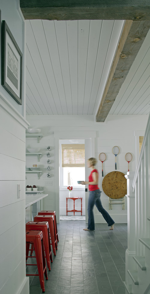
Below is a very neutral room that is completely relaxing!  All whites with exposed beams on the ceiling.  To me the red stools add such a fun touch of whimsy!  For our home, I seem to be following this design idea for the first floor of neutrals with pops of color.
Hall/Kitchen/Stairs traditional hall


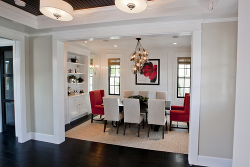
This room has gorgeous darkwood floors and white builtins, trimwork, and dining chairs. Playing off the darks and lights, just a touch of color adds so much more to this room.  Adding deep red captain chairs to the dining table grounds the room.  The modern red painting is just one more touch that lets your eye flow from one part of the room to the other.
Dining Room traditional dining room


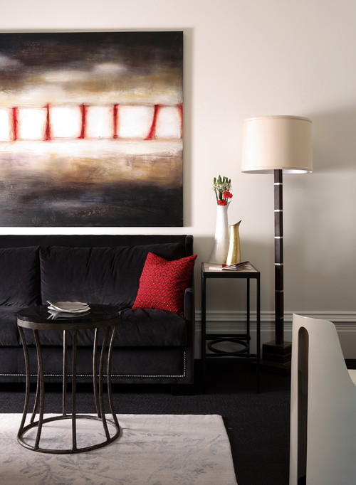
Another great way to bring in a punch of color is just a few fine touches of red in a painting amongst the darker colors and a throw pillow.  This would be a great bachelor room!
Showhouse contemporary family room

 
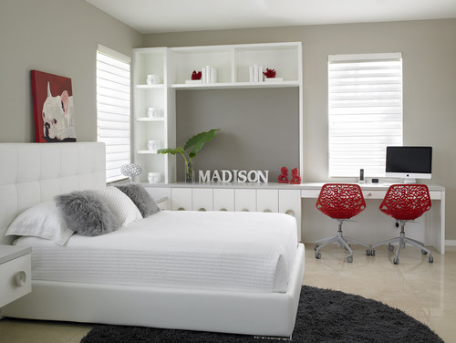
How stinkin' cute is the french bulldog painting above the bed!  Can you believe how you can take a neutral room with grays and whites and give it such depth by bringing in red chairs, a red painting, and a few red accessories on the desk.  A great room for a teen!
Adams contemporary bedroom

I hope you found inspiration from some of these beautifully designed rooms.  Thanks for stopping by :)

May 22, 2012

Seaside Interiors Logo

Do you know what today is?  Today is DECISION Day for me and the decision is not going to be easy.  In my last post, I shared with everyone that I am starting my interior decorating business.  Whoop! Whoop!  Yesterday I went to the bank and set up my business accounts and business credit card.  So everything is feeling more and more official as the days go by!

Today, I received my logo drafts from Mixed Molly Designs.  Do you ever tell yourself, "Don't get too excited or you may get let down, before you look at something?"  Well, I took a little breath and told myself "this is just the first draft."  Are You Kidding Me!!!   AWESOME!!  I wasn't expecting to like all of the drafts, but I do for various reasons. 

So far, my decision to have someone (insert Molly here) who knows what their doing is paying off BIG time!   I could have never come up with these designs!


 I chose the name Seaside Interiors because I like to decorate with a relaxed laid back style and I always want my clients to feel as though they are coming home to a vacation!  Or as I like to cheesily(that's a word) call it a "Staycation." 

So, I would love to hear what you guys think!  What is your favorite design and why? 

Design #1
Top right with the slender starfish design. 

Design #2
Right Below Design 1.  It has the business name with a tiny little wavelike pattern running through it.

Design #3
The larger starfish design on the left.

Design #4
The bottom design with the word Seaside that looks like the peaks on waves.


So, there they are!!!  Let me know which one is your favorite! 

Oh, I almost forgot, the designs are done in black and white in the first draft phase.  Molly had mentioned that the best designs are done in black and white and then you can bring in color after you see it in this form. 

May 16, 2012

A New Path

I hope you are all having a great week!  Today, my post is a bit different than previous ones.
Most of my blogging thus far has been about the projects going on around our house and the inspiration I have found from other bloggers and decorators/designers on the web. 

 I wanted to open up a bit more and share a few things about myself and what I am currently up to. 

As of last April, I received my teaching license to teach elementary school k-6.  Since receiving my license, I have been working as a substitute teacher in the school district in our area.  I have gained a lot of experience working with the students in all elementary grade levels, but so far, the teaching jobs in our area continue to be far and few between.  I haven't given up hope on a teaching job, but I am also looking down other avenues. 

Throughout this past two years, while I was working towards becoming a teacher, I have also been heading down a different path without even knowing it :-)  
To me this couldn't come at a better time! 

The other path I have decided to take is
Interior Decorating

 I don't know where it started, but I know that I have always loved the ability to express myself in various artistic forms and interior decorating seems to come natural to me!! 

Let me take ya back...

Eight years ago, I started a cake design business with my mother in law.  We started from scratch, but moved quickly from the regular bakery style sheet cakes in to some amazing works of art for our clients.  I worked with my mother in law to design the cakes and from there I was able to bring the cakes to life!  Many of our high end cakes that I was fortunate enough to create, where published in Wedding Cakes, A Design Source Magazine.  It was something I never imagined would happen and to this day, was one of my biggest accomplishments :)

Designing and decorating cakes gave me a lot of insight into decorating!  Over time I knew what colors worked well with others, how to give the right mood or feel to a cake, and working with my mother in law, we were able to bring a brides dream to reality!
My mother in law Elizabeth Williams is still running the cake business The Magic Cupboard.  You can check out the amazing site here.  

Here are some of the cakes I was able to make during my time at The Magic Cupboard.


Choc scroll cake

Chivas Regal


Black and White Classical cake


 Sponge Bob
Spongebob was one of the funnest cakes to make!!! 

Baby Diaper bag #2
This cake was by far my favorite baby shower cake! 


weber grill
 Anyone for a backyard BBQ?


The tiara and pillow cakes always seemed to be a big hit...

purple pillow cake


Princess pillow cake


Vera Bradley look alike
 My attempt at a Vera Bradley Knock off.

fireman helmet grooms cake
A surprise firefighter groom's cake for one of my husband's co workers. 


The last two cakes describe more of my current environment of the DIY world ;-)

 home depot


Home Improvement

Just taking this little cake walk ;-) down memory lane is bitter sweet!

It was a VERY difficult choice to step away from designing and decorating cakes, but my kiddos where still little and needed more of my time than the cakes would allow! 

So, where does that leave me?  Well, I have thought long and hard about it and I have come to the decision to start my own interior decorating business.  I know, CRAZY and EXCITING all in one!!!  Currently a little more Exciting than crazy.  I went back and forth over the name and finally chose Seaside Interiors, LLC

 I have a relaxed and cozy way of decorating, I love to decorate interiors that give the feel of a retreat in your home, and I live on the East Coast, so I think the name kinda sums it up ;-) 

I still have quite a few things to do which include:

Building a Website
Setting up my Office
Make my Brochures
Begin Marketing my Business
Adding an E-Design Option to my blog and/or website
Have a logo made

A few things on the list are already underway. 

First, I am currently working with Molly of Mixed Molly Designs


 to create my logo and business cards.  I saw Molly's work on Blue Roof Cabin when she created this logo for Mimi.   


 I emailed Molly immediately!  She has a great eye for designing logos and her pricing is very reasonable and much cheaper than many of the other graphic designers that I came across.

So over this next month, I will be able to share with you my choices of logo and the completed product.  I am soo excited to see the end result!!!

Another "to do" is to set up the E-Designs portion of my business on my blog and website.  Many of you already know about E-Designs, which are also known as Mood Boards or Design Boards.  I have been creating them for a few years now.  I started doing them for my own rooms when we began to build our house and then more recently I was asked by friends and family to create Mood Boards for their homes.  I love doing them and I hope by this next week I will be able to have it set up and available on my blog. 

Here is one of the recent Mood Boards I created...


Thanks for letting me share all that with you guys!  I would love to hear your feedback and I will keep you posted on the process of starting my business. 


May 14, 2012

Pops of Green


I hope everyone had a wonderful Mother's Day yesterday!   I woke up to some really cute polka dotted rain boots from my hubby and some really awesome handmade bracelets from my kiddos!  I had lunch with my mom and sis in the afternoon and was able to kick back and relax in the evening.  It was a great Mother's Day!!!

When I kicked back last night, I started to think about how I will continue to incorporate the color green into each room on the first floor.  Some rooms like the dining room will just have accent pieces and other rooms like my office, will hopefully have a gorgeous green accent wall! 

I figure since all of the rooms flow into each other, that they need some sort of unification (my big word for the day).  I think that adding a color, such as green will help the whole first floor flow together. 
I
So, I went searching for some ideas, and I found some WONDERFUL rooms...


Nowell - Hooper's Room 1
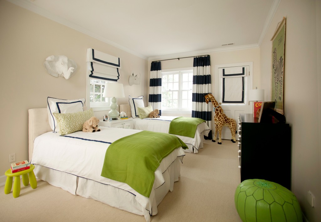
Looking at this room, makes me realize the importance of color!!  By adding throw blankets and a pouf in a bright green accent, the room is completely transformed!


Suzie: HGTV - Green Home - ivory & green kitchen design with green cushions on black counter ...
I have pulled together lots of ideas for bringing in green with different types of dishware and counter storage, but I really like the idea of adding green cushions to bar stools to bring in color.


I thought this picture had such peaceful and inviting feel.  The gray and green are a nice mix together.


When I saw the 2012 HGTV Green Home, I fell in love with the kids bunk room!   I mean come on, check out those beds, AMAZING!!  There's that little touch of green again,  NICE!  And I can't move on without mentioning the cutest bulldog picture ever!!!  So sweet.

This picture reminds me of the entry way to my office.  For our office, I want to build the wall in and do a double sliding barn door across the entrance and then paint the back wall a similar shade of green like this photo and add built ins and a desk area on the wall.  I want to do something similar to below...


Pinned Image
 I think this whole color combo would work great in the office.  I am hoping to design a mood board for the room around these colors.  It's unbelievable the difference it makes by painting the back of book cases. I have been in limbo deciding on wether or not to paint the built ins in the family room, but after seeing this photo, I think I'm ready :-)

May 09, 2012

Blue and Orange Color COMBO

As of last year, I had pulled the turquoise and orange color scheme for the basement.  Although I haven't had the chance to work on the basement yet, I have continued to see the blue/orange trend strengthen and for good reason. 

The color combination brings such an impact to a room and using different shades of blue and orange means you can take a room in different directions. 

Here is one of the many color palettes for blues and oranges...
Pinned Image


If you are using the shades in a bold way, you can have a room like this one I saw on House of Turquoise.

Pinned Image

Gorgeous!  AND the walls are WHITE, but the walls don't appear to be cold and bland.  Since there is plenty of bold colors in all of the room accessories,  it adds a ton of color which makes the walls a crisp and fresh backdrop. 


Taking the turquoise to a Navy blue, bring on a Nautical feel.  Notice how their are different shades of orange from the chairs to the pillows and lamps.  They don't compete with each other, just a nice blend throughout.

This is such a graphic statement.  The Chevron rug is beautiful.  I know chevron is everywhere in the design world right now, but I think I gravitate to this particular chevron rug simply because the graphic is done on a larger scale.  Again, very clean looking!  AND if you have a bunch of boxes laying around, grab em' and then find yourself a can of orange spray paint.  Extremely cheap for such a great look!


In this nursery, their is a complete mix of blue shades.  From the light turquoise lamp and curtains, to the turquoise baskets for toys, and finally to the deep blue color of the whales on the pillows.  Everything flows so nicely together and it is such a peaceful environment.


I can say by far, this nursery is one of my all time favorite rooms.  I have had this picture saved for quite a long time.  One for the colors, but two, for the playfulness of it all.  My decorating style is very much bright pops of color with playful twists, like the shovels in this pick.  I love the contrast of the dark browns against the white, blue, and orange. 

Please forgive me for the lack of links.sourcing for the next 8 pictures.  I have had them in a file for over a year for my basement plans.


 I love the feel of this room!!  I think it would flow nicely with the rest of the house, but it would add a nice added punch of color to the basement.


 A gorgeous batch of fabrics that would be great for pillows!


Here is a perfect Mood Board that is everything I had in mind for the space.


I just want to dive bomb that lounger, throw on the blanket, and snooze! 


 I thought these pictures of coral in frames would be a great addition to the room.  It would be so easy to print up some coral pictures in turqouise and mat with an orange piece of cardstock.  You could pick up some very similar frames at Ikea.


 I think if I could duplicate this room, I would be in heaven.  There is so much I love about it.  My favorite thing in the room is the material covered art pieces for the wall.  I don't remember the name of this fabric, but I just pulled the exact fabric in a chartreuse green outline as an idea for the office.  I guess I didn't realize how much I loved the fabric a year ago.  You could actually paint your own version of these on some drop cloths stretched over and stapled to 2 x 4 wood frames. 


This room would be so cool for a teenage boy.  It is amazing that painting a geometric shape behind the sword fish creates such a substantial backdrop without having to build a frame out.  A budget friendly option.


And the Blue and Orange Color Scheme does not stop there.  Many brides are picking up on the powerful impact that this dynamic duo can have on their BIG event.


WEDDINGS


Pinned Image
Again, here you see a Mood Board for a wedding with the Blue/Orange combination and this bride has pulled various shades of orange and blue/turquoise.  Adding more than one shade of the same color can give you a layered look.


Pinned Image
Same for this bride.  I love the pumpkin roll bringing a light shade of orange against the white cream cheese filling, but I think most of all, I love, love the tie.  It is the entire color palette for the wedding and on that one little piece of material, you can get the vision for the entire wedding.  Isn't it funny that one piece of fabric can do all that?


There are quite a few other color combinations that are taking shape as contenders for this year's fashion in decor and clothing design, but I couldn't pass up sharing the BLUE and ORANGE combo.  It was just too much fun!!