Pages

July 30, 2013

Lemon Fresh Laundry Room Makeover

What is your most favorite room to spend time in?  I think I might know.  Is it.... 


The LAUNDRY ROOM???  

No, well that's funny.  I thought that was everybody's fav. hangout! ;-)

Since most of the time we usually just head in to throw some clothes in the wash and come back when the buzzer goes off, wouldn't it be fun to enjoy the time you spend doing laundry?

I have created design boards for Anna's down stair spaces, so to finish things off, she wanted me to help give her a freshened up Laundry Room.  

Working in some of her existing pieces, this is what I put together for the new Laundry Room...


A new fresh and bright space to get it all done!  

When creating a design for a room a lot of the time you are working around existing pieces of furniture or items in a space.  That was just the case here too.  


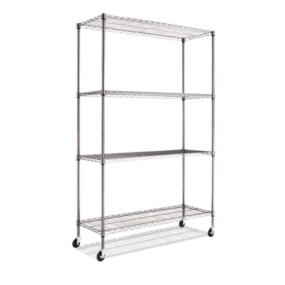
Anna had a large industrial cart that she wanted to use for laundry storage.  In the design, I chose three larger baskets that can be stored on the shelving unit.  

I recommended that Anna add some chalkboard tags to the baskets to label them lights, darks, and colors, etc.

Beachcomber Oversized Rectangular Basket


The main jumping off point for color was the fabric that Anna is using for her window treatment.


This striped fabric is from PKauffman and is called Promenade.
It has the yellow, green, and blue that I am pulling into the room through paint and other fabrics including the ironing board cover and additional green bins for storage on the top of the cart.


To change up the beige color on the walls, we are going with a soft buttery yellow.  Yellow just seems to have a mood changing effect on a person.

The inspiration picture I chose was decorated by one of my favorite designers Sarah Richardson.
   

I also chose this photo because my client is going to paint out the existing cabinetry in a white finish, so it gives her the visual of what the room can feel like.

To finish the cabinets off, I suggested  this oil rubbed bronze hardware...

Rusticware 1-1/4-in Oil-Rubbed Bronze Traditional Oval Cabinet Knob


To keep the bronze finish going, I chose this cast iron set of wall hooks that will give Anna space to hang delicate clothing.

Cast-Iron Row of Hooks


I also chose this semi flush mount light fixture with bronze accents for the space...
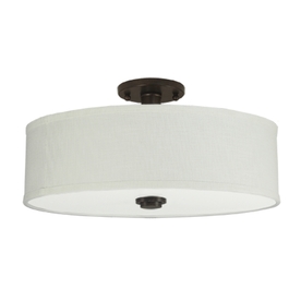
Good Earth Lighting 19-in W Valencia Dark Bronze Fabric Semi-Flush Mount Light

To finish off the area just above the washer and dryer, I chose a wall decal.  The great thing about decals are that they can be rather inexpensive and they add a little added fun to a space!
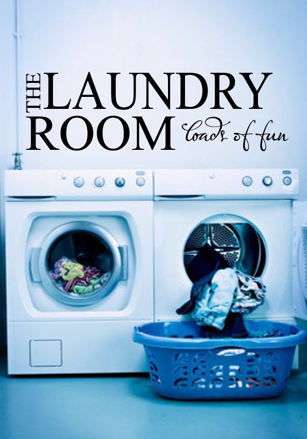
Laundry Room Decal 8"x25" The Laundry Room Loads of Fun Laundry Room Decor Vinyl Lettering


Here are some of the Before Shots that the client sent me...


Older honey colored cabinets and beige walls are ready for a change! 

And here is the design board again...


If you would like a Design Board Package created for your budget, you can email me at seasideinterior01@gmail.com.


July 29, 2013

Kids Nautical Bathroom Reveal

Ok Ok so the bathroom is not fully finished yet.  We still need a few finishing touches, but it is pretty much there and the finishing touches, well they may take just a smidge longer! I didn't get a chance to create the artwork last week, so I thought I would snap some pics of how far we have come with the makeover.

If you didn't get a chance to read the process of picking paint and demo of the bathroom, you can read those here and here.

I created a design board for the kids bathroom that had a fun and funky feel...


We did change the accent color to be an apple sort of green shade instead of orange and we went for a soft tin shade with the lighting instead of the bronze, but everything else followed the original design board.

Here is how it was BEFORE...

Before it had linoleum floors, a builder grade mirror. over head lighting, and honey cabinets.  The tile only went up to the top of the shower curtain.

And Here is the ALMOST AFTER of the Kids Bathroom...


Tile: Lowes
Towels: Target
Shower Curtains: Target
Over head Lighting: Lowes
Numbers and Hooks: Home Depot
Soap Dispenser and Toothbrush Holder with Tray: Target
Wall Paint: Sherwin Williams" Repose Gray in Satin Finish
Cabinet Paint: Sherwin Williams" Indigo Batik in Satin Finish
Trim Work and Ceiling Trim and Boarding: Benjamin Moore's Decorators White in Satin


The green towels definitely bring that much needed color addition to balance out all the navy and white. For the curtains, I wanted to do two floor length curtains, so I purchased three of the same Navy and White stripe shower curtains from Target and had them sewn together.


Above the wall numbers, I am going to place two pieces of artwork to bring in all of the colors that are in the bathroom along with an extra color or two.


I really like the tin colored goose neck lights that we chose for over each sink.  It gives a little nautical touch without being two much!


Originally we had painted the frame out that we put around the mirror the same BM Decorators White, but it didn't stand out and the frame around the mirror and the counter top where two completely different whites.  The counter was creamy white but actually looked yellowish against the frame.  Dustin's solution: Paint it blue like the base cabinet.  I got a package deal when I married that man.  I really love working on projects together to see what we come up with and or disagree on.  In the end, it always turns out.

 A closer shot of the lighting and framed mirror.  Also, you can see on the ceiling that we went with wide sheets of board that gives the look of putting planks up, but not the cost.  The ceiling was then trimmed out with 1 x 4's.


 Soap and toothbrush accessories from Target to bring in a little of the soft caramel color that goes with the trash can and will go with the artwork for the wall.


Dustin rolled the cabinet and sprayed the doors and drawers and he did such an AMAZING job with the finish!   For a kids bathroom, I think this is the perfect color.  For the life of me, I can't decide on a rug for the space.  I have gone through about 7 rugs and none of them are it :(  I will keep searching.  

A comparative BEFORE AND AFTER!!!


A BIG difference!!!

In this shot on the right, you can't really make out the tile work on the back wall, but we took the white tile all the way up to the ceiling so that it is the same height as the shower curtains. 

Thanks for stopping by and seeing the progress.  

Next up for home projects is the Mud Room Makeover that we will be in a race to finish up before the kids start back at school.


July 25, 2013

Dining Room Design Makeover using the CB2 Firefly Pendant!

I was contacted several weeks ago by Donni and Bill.  A couple that had purchased an older 70's home and where looking for some much needed updates.  They had purchased the home only three weeks prior to our meeting and where so excited to get started on the transition. 

Only one month later, we had new furniture, new artwork, wall accessories, new lighting, and a freshly painted house!

Here is the Dining Room now...

Full of light and some punches of color!  The artwork on the fireplace was chosen by the clients.  They love sailing so when they came across this piece it really spoke to them.  The more personal elements you can add to a room, the more it allows the family to feel like the space is tailored to them.


To the dining table, we added a bench seat on one side and kept the three main seats on the other.

The rug from World Market is a bit tough to see in this picture but it has so many colors in it.  I will try to get a closer shot of it when we take pics of the living room side of the makeover since we have the same rug in there too.


One of my all time favorites to bring texture and aroma into a room, just add a bag of coffee beans to each glass candle holder and push in a candle and every time you light the candles it has a "did someone get Starbucks" feel.  Can't go wrong.

To add another layer of texture I chose a natural and organic fabric runner to go under the candle holders.


The artwork was chosen by the clients.  They love sailing so when they came across this piece it really spoke to them.  The more personal elements you can add to a room, the more it allows the family to feel like the space is tailored to them.


Ahh Magical and Sparkly!  I may say this here and there, but truly the most important element in a room is lighting!  The rest of the room can kinda be naked, but if the lighting is great it feels all dressed up!  

The electrician went above and beyond on this job to install all of the lighting.  I opted to order two of the CB2 Firefly Pendant Chandeliers and had them rewired to drop down 10 feet over the dining table.  I had them pushed together at the base so it would appear as one continuous chandelier.

Sometimes a room just needs a few added lighting elements, but this home, built in the 70's had no ceiling lights what so ever!  I also had the electrician add 4 recessed lights to give the couple additional lighting in the space.


This is the Beam Wall Candle holder from CB2.  It houses 10 little glass cylinders for tea lights that adds plenty of mood lighting.


The glass framed hanging pieces in the doorway where from the previous owner and the clients wanted to keep them.  So by adding the baskets on the wall between the pieces, it made them all feel like a grouping of artwork together and now the glass work pieces feel like they now make sense.  For my own personal irritation for things being symmetrical, I wish the previous owner would have either gone with two of the rectangles or two of the octagons.  

The wall color we went with throughout the house is On the Rocks by Sherwin Williams.  It is such a soft pretty gray!


Let's take a peak at what the room started out like...


Originally the dining room had a smaller table and chairs that didn't fit their design scheme. 


The original buffet went with the table but again, not what we were going for in the more contemporary design.


 No recessed lights or hanging pendants.

Outdated curtains that the client took down within days after we met.  She couldn't wait to have them gone :)


An empty fireplace that was calling for some artwork.


And here is the after again...


Stay tuned for the Living Room Transformation!  It's nearly complete!

July 14, 2013

Dining and Living Room Transformation

I hope you had a great weekend!  Is it just me or is summer flying by for you?  It's seriously the middle of July and I feel like the kids just got out for summer break yesterday.  This coming week is a mix of things for us.  We are finishing up painting a client's home and installing the finishing touches on Friday.  The kiddos bathroom is just about complete. FINALLY!!! 

So to finish things off my daughter and I are going to have a little fun painting today and I am going to do two pieces of artwork for the bathroom.  I am hoping to share pics later this week on the DIY Artwork and Bathroom Makeover.  

For the Design Board side of things, I completed the last portion of a first floor home makeover that I am excited to share today.  

I have been working with Anna for several months now, helping her transition her home into something she truly enjoys coming home to.  Anna wanted the living room/dining room side of the house to be a little more of an adult space.  She wanted it to be simple yet classy.  This is the Design Package I created for her...


Living Room Space


Dining Room Space

I always have a lot of fun putting together design packages, but this one turned out to be one of my top favorites.  I think maybe because of the color combination and feel of the different wood finishes that make it feel like such a warm place to be.

The great thing about her design is that it is a low budget makeover.  

Here's a little look at some of the pieces that I chose for the dining and living room space...

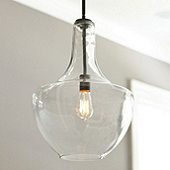
Sawyer 1-Light Pendant

The wall art for the dining room...

Antique Resin Tile Wall Sculpture -  Distressed

And the wall art for the living room...


Leaf Burst Wall Sculpture
Three of these guys will go over the sofa.


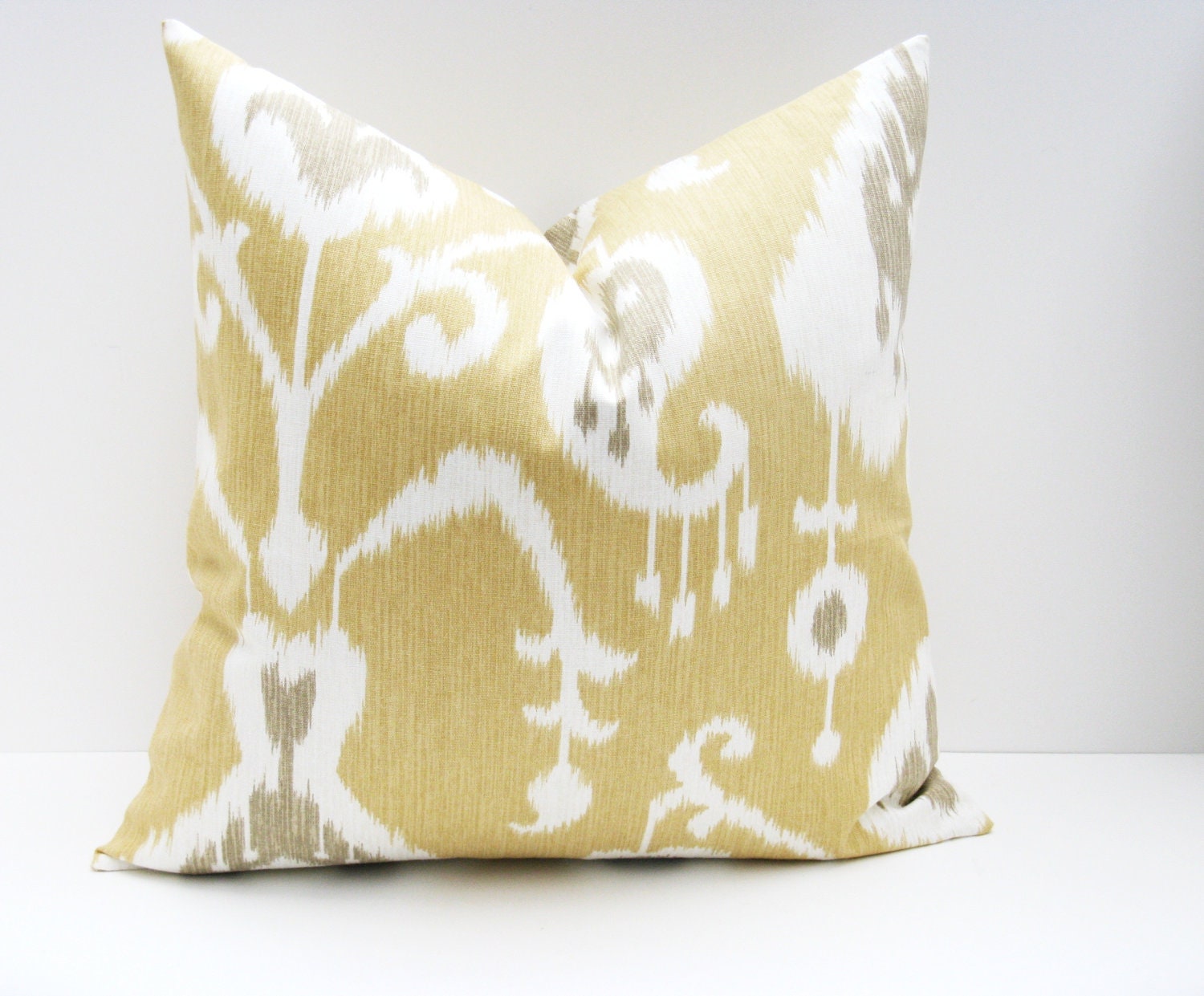
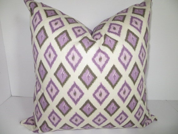
I also love the pillows for the space!

Throw Pillow Cover. Decorative Throw Pillows. 18x18 pillow covers. Tan Ikat Pillow ONE 18x18 printed fabric on front and back


Decorative Pillow- 20x20 Purple Pillow-  Lavendar pillow, Cream Pillow, Geometric Pillow


Here are a few of the wood finishes that I think go well together...


A coffee brown side table that will add a little funkiness to the living room area.  

  A really lovely two toned brown sideboard to store all the dishware for the dining room.


white dining table


And to finish the space off, I suggested that Anna paint her existing dining table in white.


Threshold™ Slipper Chair - Yellow/White Trellis

Two of these golden yellow patterned chairs will add extra seating to the space while also bringing in a nice geometric pattern.  


So how will all this furniture and accessories be arranged?

Here is the Room Layout that I think will best suite the space...


And here are both Design Boards again...


Hope you enjoyed this weeks Design Board Package.

If you would like a Design Board Package for your home, please contact me at seasideinteriors01@gmail.com.