Hey guys, I had mentioned last week or so that I was creating some design boards for a mom in Oregon. I finished work on her Family Room Design and after getting great feedback on it, I quickly got started on the adjacent kitchen and pantry.
Anna has two boys running around the house, so she wanted to keep the fun and lively feel going into the kitchen while still not losing the style and feel she is going for.
Working in the existing space, I wanted to give the room some character, but not have it feel completely different from the Family room.
To do that, I kept a similar color scheme.
Here is the finished results of Anna's kitchen design board...
Source List
I went with a different shade of gray from the Family Room. For the kitchen I decided on Knitting Needles by Sherwin Williams.
I also went with the same gray curtains as the ones I chose for her Family Room since the large window in the Family Room and the sliding glass door are both close to each other. When looking in from the hall, I wanted it to flow well from one area to the next.

My client has a kitchen table that she would like to repurpose. I suggested painting it in a white finish and having the golden honey colored rug to go underneath the table and a smaller mat size to go by the sink in the same pattern.
Since she wanted fun, I thought maybe the pantry door would look great in a shade of turquoise like the inspiration photo I found from Tater Tots and Jello.
To tie in all of the colors from the design board and pull the curtains and even the wall color into the mix, I found this ADORABLE fabric from fabric designer Deborah Edwards. It is so fun and playful! Anna is going to turn into a window valance to go above the kitchen sink.

I chose a canister jar set in the same honey color to bring some of the color on to the counter top.

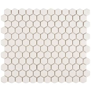
For the back splash tile, I went with a simple white mosaic tile that I think will compliment the cabinetry well.

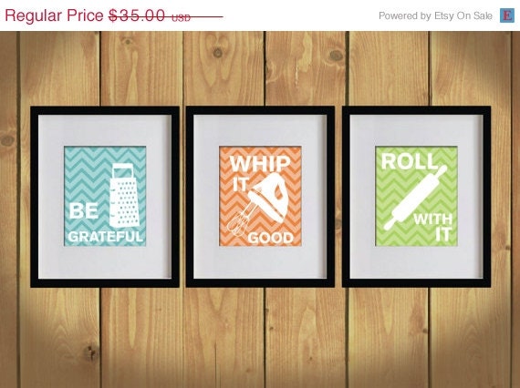
I think one of my favorite finds was the kitchen typography artwork for the walls.

I recommended that my client stick with the turquoise chevron background for both pieces of artwork and then choose which kitchen utensils and phrases she likes best. The Whip it Good one would either have me singin the "Whip It" song or my version of the Salt and Pepper song "Push Whip it Real Good, bom be dom bom be de de dom. Either way, I'm sure my kids would be THRILLED with me singing "Whip It" every morning. I'm gonna go with probably NOT, since my aunt so lovingly told my sister and I we sound like to Bleepin cats getting burned on a stove when we sing. Aww, I love those truthful family members!
Anyway, I think the artwork is so much fun :-)
These will go on either side of the sliding glass door to give a punch of turquoise color to that area.
One of my favorite spaces to come up with some fun organization and design ideas is the pantry. Check back for my next post on the cute little Pantry Makover Design I created for Anna.
Have a great weekend!!!
If you enjoyed this post and don't want to miss out click up top there on the right and follow along ;-)
For information on my on-line design services, please click here.
For on-site design services {Greater Hampton Roads and Richmond Virginia}, please email seasideinteriors01@gmail.com for pricing and availability.
Seaside Interiors


No comments:
Post a Comment