This past week has been all sorts of crazy :) Mostly excitement, a little bit of nervousness in the hopes that the room I was designing for the client turned out as well as I had envisioned it, but now it is DONE! Whew!! We learned a lot from the process! When you think something is going to take an hour, you can pretty much add 2 more to it, lol. There where a lot of DIY projects and furniture makeovers that we completed to finish the room! All in All, it couldn't have gone any better! I lucked out having such an awesome client from the get go. She gave me the go ahead to do whatever I thought looked best and in the end I was able to give her what she calls "A Vacation Resort Bedroom." I promise I will get some great shots this week and share with you my before and afters.
So let's have a look at some fun inspirational pictures of the 2012 Homerama...
This house was one of my favorites! I can never get enough of the turquoise and red color combo!!
The red and turquoise on the shelving were just paper covered books. Such an easy way to add color to a room.
And the kitchen with a great back splash and red island.
Bedroom Number 1
This room was so soothing and relaxing and had some really fun touches.
HIS...
And HERS...
A piece every girl should own to display her beauties!
I love the over sized canvas of the couple in black and white. I usually like a punch of color, but there is something soft and subtle, but still adds a big impact to the room.
Bedroom Number 2
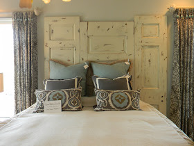
Although the bed is a little off from the headboard, I really like the idea of combining different sized doors to create a headboard.
This lamp is made of Oyster Shells, I just love it!!!
I really like seeing a painted out tray ceiling, especially a different color than the walls. It brings warmth to the room and makes the trim pop out.
These curtains are nice, but what I love most is the fabric covered buttons in the turquoise color.
Eek! Soo cute!!!
One thing you may have gathered about me is that I love using palettes to create art or build furniture pieces with, so this guy was right up my alley!
How funny is this? Maybe I can do one for my husband that says, Please put the seat down! Maybe then I wouldn't land my tush in the water in the middle of the night. Just sayin' :)
Hope you enjoyed these photos, I will post the second set of pictures tomorrow, which includes a great boys room with some awesome ideas and a girls princess room with a really unique closet design.


I love both the color schemes. Pairing turquoise and red with the animal print is awesome!
ReplyDeleteTotally agree, I think the animal print put it over the top!
Delete