Pages

January 17, 2014

A Warm and Inviting Living Room Design Package!

The process of putting together a Design Package and bringing it to life is so much fun!  Recently I met with my new client Susanna.  When we met for her consultation appointment to transform her living room and kitchen, I was immediately excited with the direction I wanted to take the spaces.  I found that she loved the color red in her home, while her husband really likes a smoky blue.  Also, in talking with her, I found out that her husband and two sons LOVE aviation and building model planes.  They are also into all things gear and pulley oriented.  I am often asked, how do you incorporate the things you love into a space, without getting too "themy."   Today I wanted to show you how I worked hard to pull every one's needs and likes into the space without making it too much of one feel and not making it too "themy."

Here is the Design Board Packages I created along with the photos of the space.

For the Living Room...


For the design, I pulled in just a touch of the pulley system with the amazing floor length lamp and a nod to the aviator men in the house with one or two airplanes and the fan that looks like a propeller, which was one of the options Susanna picked out.  The great thing is that when the boys saw the design board, they wanted to help and make and paint the model planes to go in the space.  I can't think of a better way to make that room feel more like their own than by having them create something to go in the living room.  We also can't forget the lady of the house so I added a gorgeous and vibrant red poppies painting to the mix to go above the fireplace!

Here are a few of the pieces close up and some that I couldn't fit onto the board...



A gorgeous fan from Minka Aire.

A beautiful piece of artwork!!  This brings in the shades of blue and red, but adds a the much needed touch of femininity!


Two of these pretty boys will flank each side of the fireplace and to soften them up with a bit more texture,
two of these faux sheepskin pillows...


Faux Sheepskin Pillow Covers


Clift Glass Table Lamp Base - Smoke Gray

Really pretty blue glass based lamps to pull a little more of the blue feel into the room and a coffee table that brings in more texture...

Durham Cocktail Table

Below are the BEFORE's of the room...

Over to the right between the two windows will be the black unit seen below, that the clients currently own and new smoky blue drapes to go on all the windows.


Susanna has had this sofa above for many years and is ready for it to retire, so we are bringing in a new white slipcovered sofa.  Behind the sofa, I am adding the long sofa table below that will fit snugly in between the pillars...


Over to the left there where the black unit currently sits will be a brand new white built in bookcase and shelving unit.


The red chair will be scooched over to the right corner and a new side table and lamp below will allow for a cozy little reading nook...


The fireplace is also getting a makeover.  If you see above, there is space all behind the picture that is hanging, so we are going to keep the space for storage, but have a secret framed hinged door that will allow for artwork to go up, but still keep the storage behind.

The base of the fireplace will also be built up to create a shaker style finish and add more depth to the fireplace.

Here is the layout for the living room...


So now all we need to do is finish up on some purchases for the space and then February starts the painting process and fireplace makeover.  Then I can go in and put it all together :)

Stay tuned for the kitchen portion of the Design!


If you are in the Hampton Roads and Richmond area of Va and would like a consultation to begin transforming a room or rooms in your home, you can reach me at seasideinteriors01@gmail.com.

If you are located outside of the Hampton Roads and Richmond area and would like to have a Design Package created for a room in your home please contact me at www.seasideinteriors01@gmail.com.

January 09, 2014

BEFORE and AFTER on the Savage Drive Townhouse Rental FLIP: Kitchen

I have always wanted the chance to get my feet wet in Flipping a Home to sell or rent out and recently I got the opportunity to do it on a small scale.  We had about 4 weeks from start to finish to get the job done and all though there where not any major plumbing changes, etc.  The Before and After of the kitchen and bathrooms were quite significant!  Today I will share the biggest change in the space: the KITCHEN.

The Layout of the town house is a regular two story home with kitchen, bathroom, dining area, and living room downstairs and then two bedrooms and full bath upstairs.

Let's take a look at the LOVELY new Kitchen and the umm, NOT so lovely BEFORE...

THE Kitchen


Here's What we started with...


AND  this is how it turned out!  I really love how everything looks.  

Benjamin Moore's Revere Pewter for the all the walls throughout the Home.  All the lighting was from Lowes and Home Depot.

 The wall before blocked the view from the kitchen and made it very dark in there, so the kitchen was opened up to make room for a bar and 2 new pendant lights.

Let's take a little look back and see the wall coming down...


Nearly There...


And Viola!

Also, the tile is the same tile I have used in my home.  It is called Mitte Gray. You can find it at Lowes (Here) for a great price!  It has slight variation in it to give it enough interest while still keeping the solid gray feel overall.  I chose white grout for my house, but since this is a rental property, we went with a putty finish similar to the walls.  The tile was brought from the kitchen to the dining area and down the hall to the front door.  For a rental property that is getting a lot of use, why not lose the carpet in the high traffic areas all together?  That way, when you come in with groceries, etc. on rainy days, you can walk straight through to the kitchen without touching carpet.  


The bar top goes all the way around and down the wall to allow enough space for a small microwave or other appliance.  The breakfast bar is wide enough to accommodate chairs so you could easily fit two stools on either side to create a space for four people.


 Instead of replacing the cabinets and costing the client thousands, a shaker style wood frame was added to the current doors and then the doors were painted Benjamin Moore's White Dove and finished with new hinges and hardware.

Here you can see a closer shot of the woodwork.  The only piece of wood that was replaced is the panel above the doors.  The original had gouged and missing pieces of wood, so a new single panel was created and put in its place.  New tile was laid throughout the kitchen and new laminate counters were added to finish it off.


Previous Laminate Flooring throughout the kitchen, before the Tile was put in.


Old Yellowy Counters made way for new laminate counter tops...


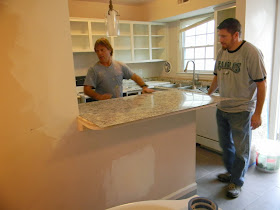
The counter tops come prefabricated at Lowes or Home Depot to fit the standard set up for a kitchen.  Since the bar counter was custom made (see the pic. below), they had to glue a sheet of the same laminate down to the top and then finish off with a piece around the edges...


 Lots of work for the crew, but they always pull through and get it done quickly!!!  Great job guys!!

And some more of the finished kitchen...


Some new hardware and silver hinges instead of old dingy rusty ones finish off the cabinets.


Thanks for stopping in and seeing the progress!


If you are in the Hampton Roads and Richmond area of Va and would like a consultation to begin transforming a room or rooms in your home, you can reach me at seasideinteriors01@gmail.com.

If you are located outside of the Hampton Roads and Richmond area and would like to have a Design Package created for a room in your home please contact me at www.seasideinteriors01@gmail.com.